New Viz Component for Splunk's Dashboard: Parallel Coordinates
Depicting relationships in high-dimensional datasets

I worked for the dashboard and data visualization team at Splunk, a cloud-based data platform company for Cybersecurity, IT and DevOps. For this project, I extended the existing viz libraries to include parallel coordinates, a new component that's highly requested by customers. I built this reusable component from scratch using React.js, TypeScript, D3.js, styled-components, and HTML canvas. This component is available to use in Splunk Cloud Platform version 8.2.2109 or higher.
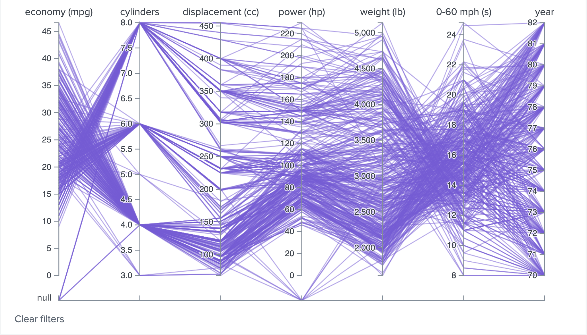
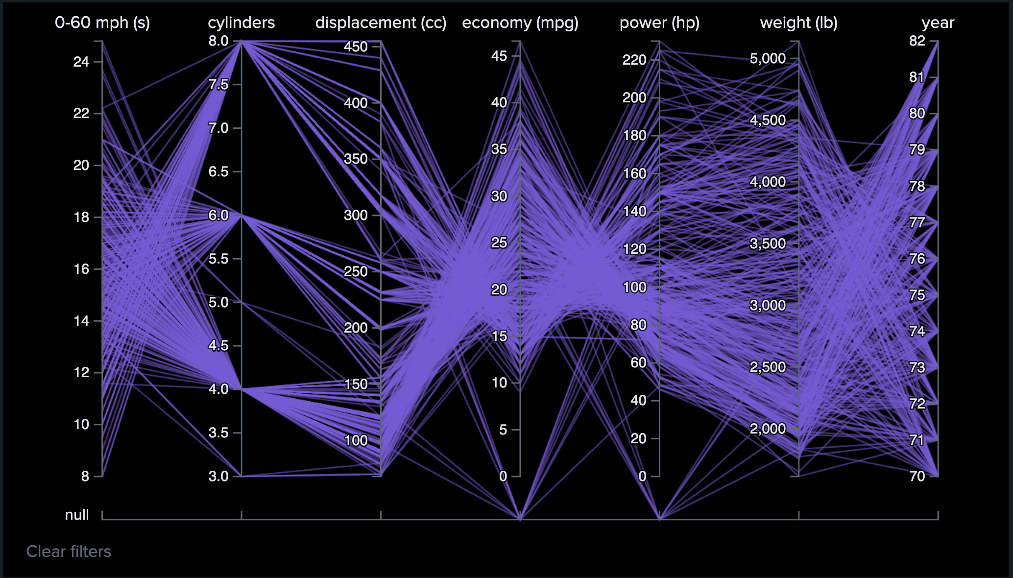
Parallel coordinates are used to depict relationships in high-dimensional datasets. This visualization is ideal for comparing many variables together and seeing the relationships between them. Each variable is given its own axis and corresponding scale. In addition, all the axes are placed in parallel to each other.
In a parallel coordinates plot, values are then plotted as a series of lines connected across all the axes. The ordering of axes can help discover patterns or correlations across variables.
Here's what the viz component looks like with a car dataset. Attributes about a car such as economy (mpg), cylinders and displacement (cc), are all plotted in parallel below:
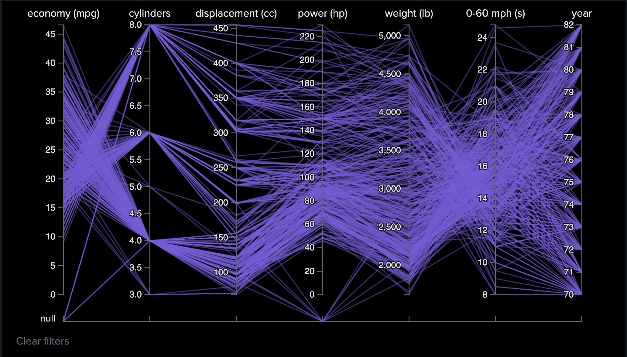
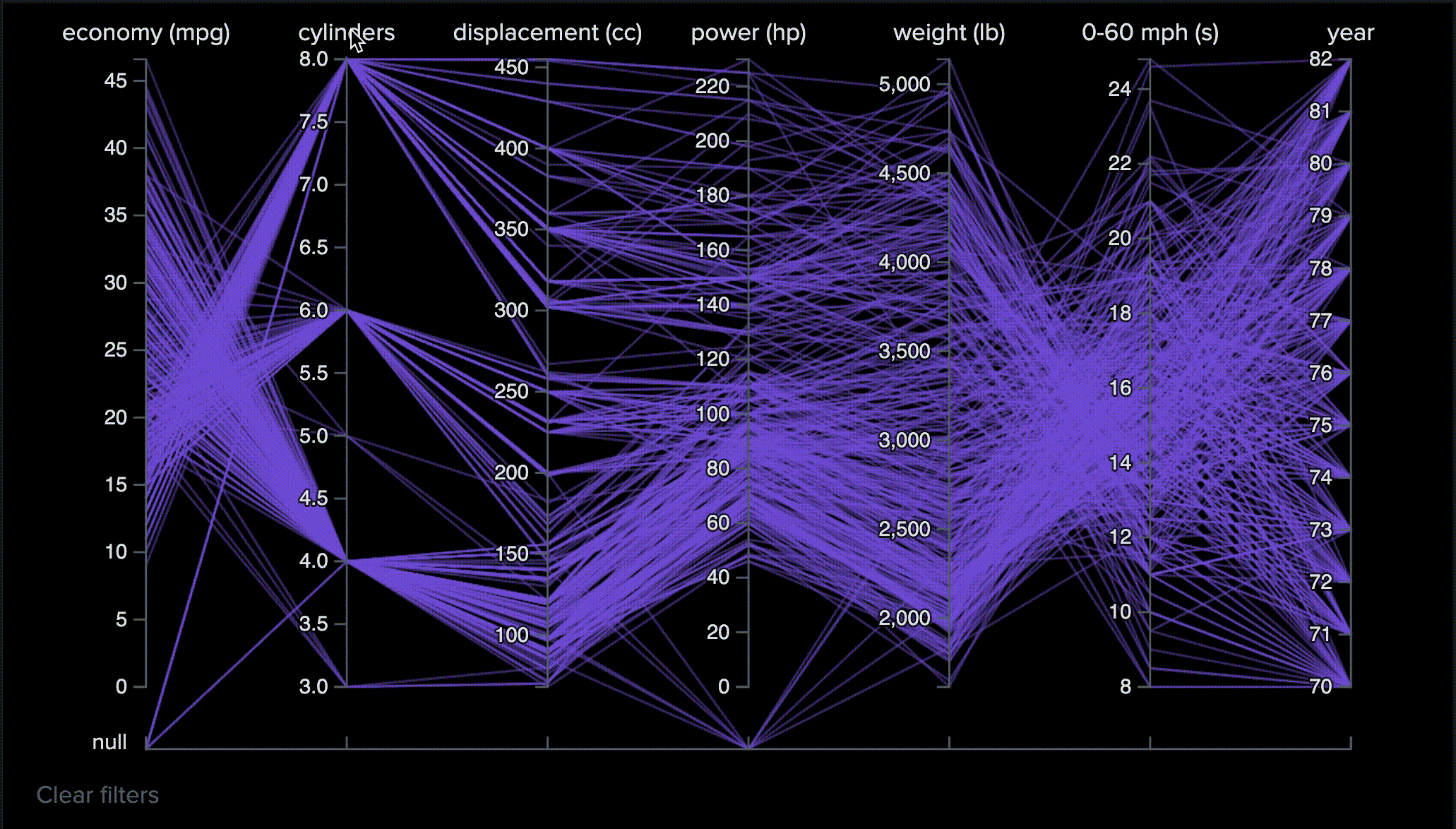
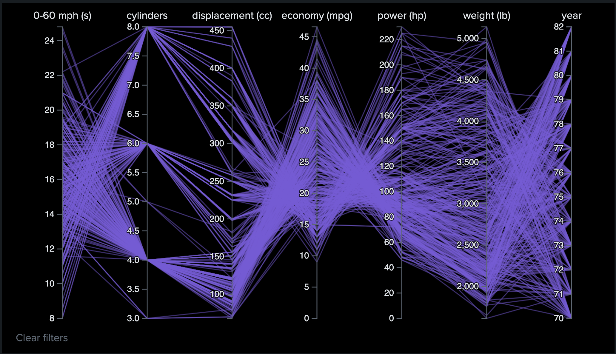
In the latest release, users can filter the data and reorder the chart by dragging an axis.

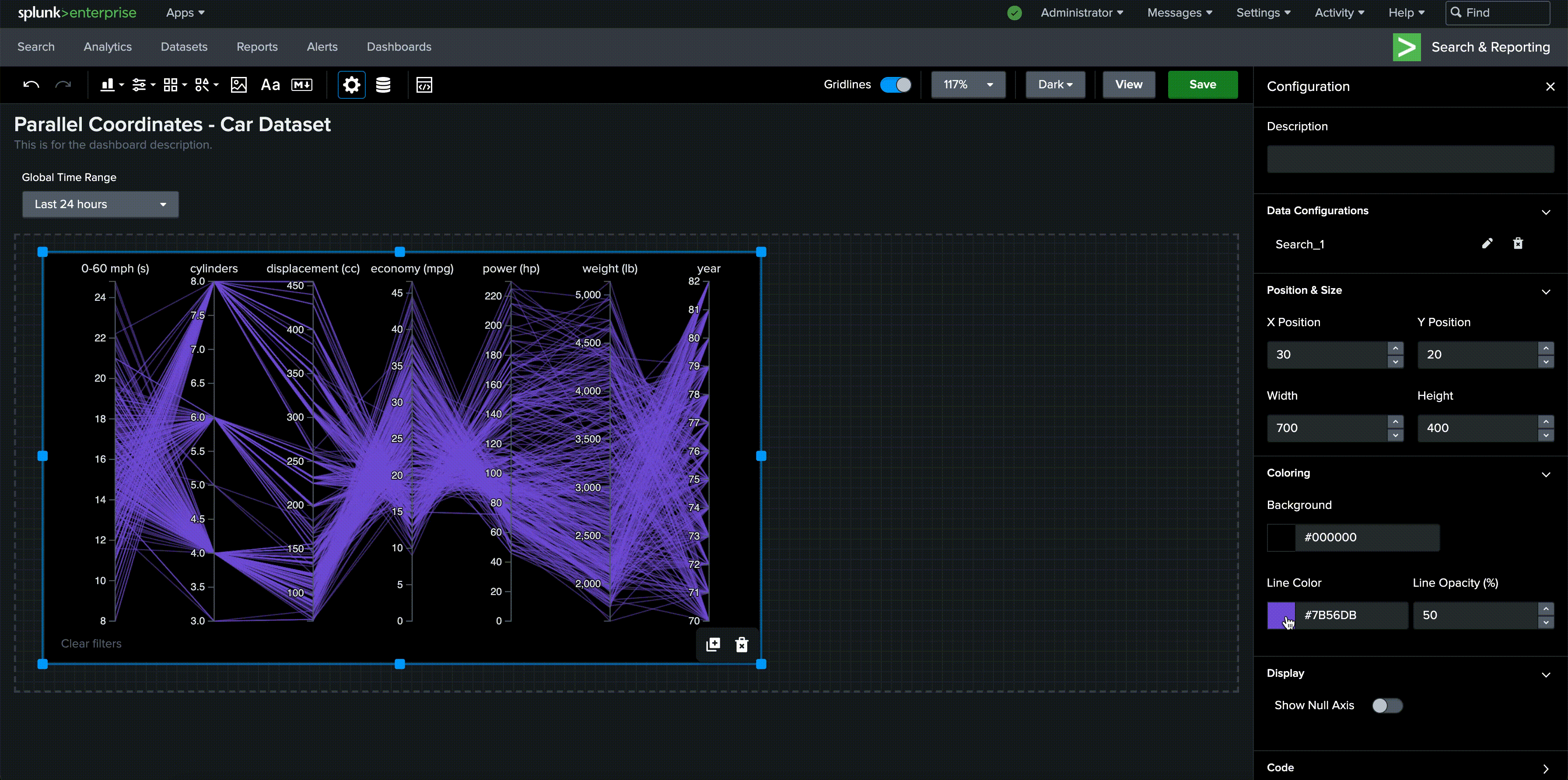
To help users get an overview and better understand the distribution of their data, we added a feature called show null axis, which users can enable, to visualize missing values.
Users can also change background color, line color and line opacity in editor UI.
Immediately after the release of the component, we have received positive feedback:
"Nice work! I've been looking for the best way to showcase relationships between some KPIs for a recent project!" —— Derek, performance software engineer at Splunk