Is Texas really going purple? Look up your district
The project has received 24,000+ views till August 2019
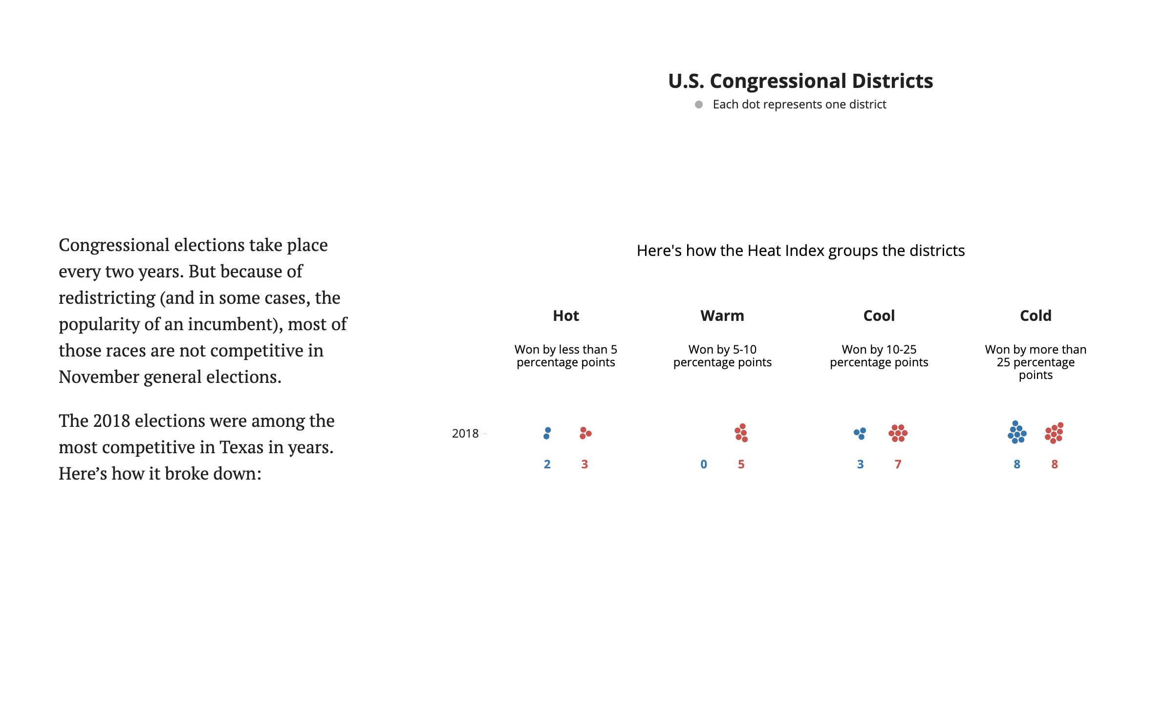
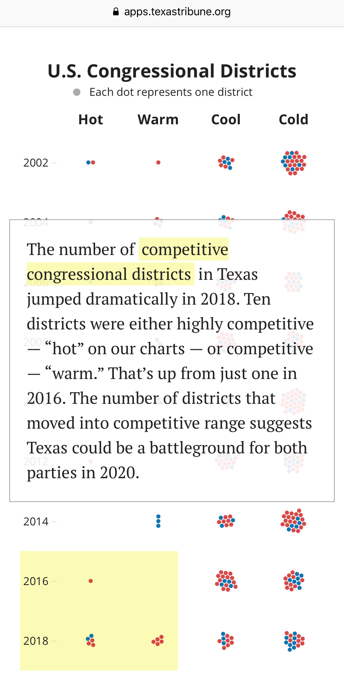
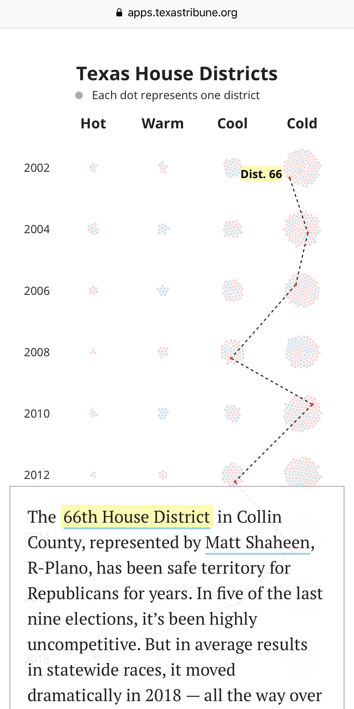
For this project, we used voting data to explore whether the 2018 elections marked a new trend toward more competitive general elections or a one-time swerve away from the steady quarter-century pattern of Republican dominance. We created our own “Heat Index” to clearly visualize which districts were competitive — and which weren’t.

To us, this is a better way to explore the politics of the districts. Looking at how each party fares on average in a district in statewide races ignores that noise to highlight broader political trends. Users can also look up an address and see that district’s competitiveness in different races over time.
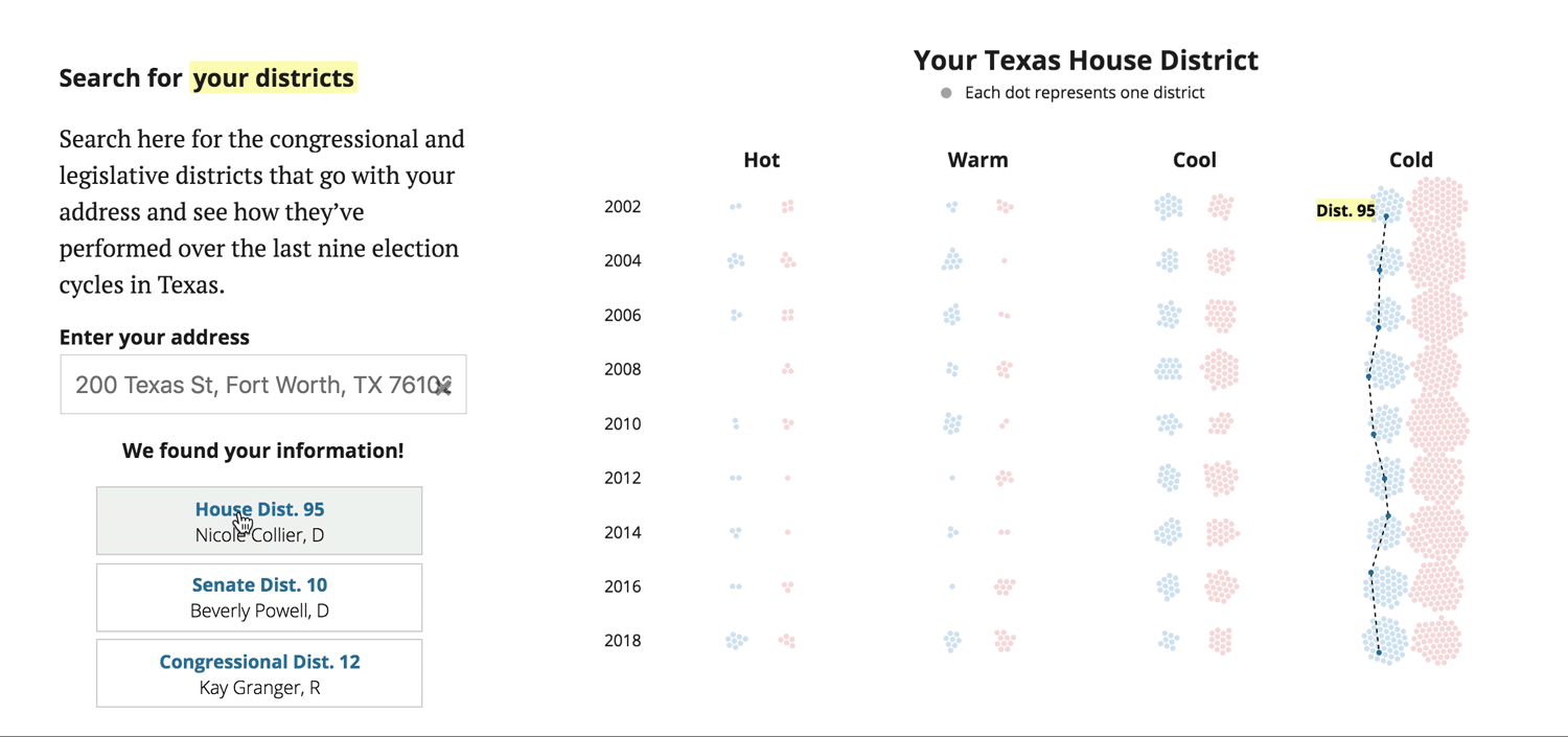
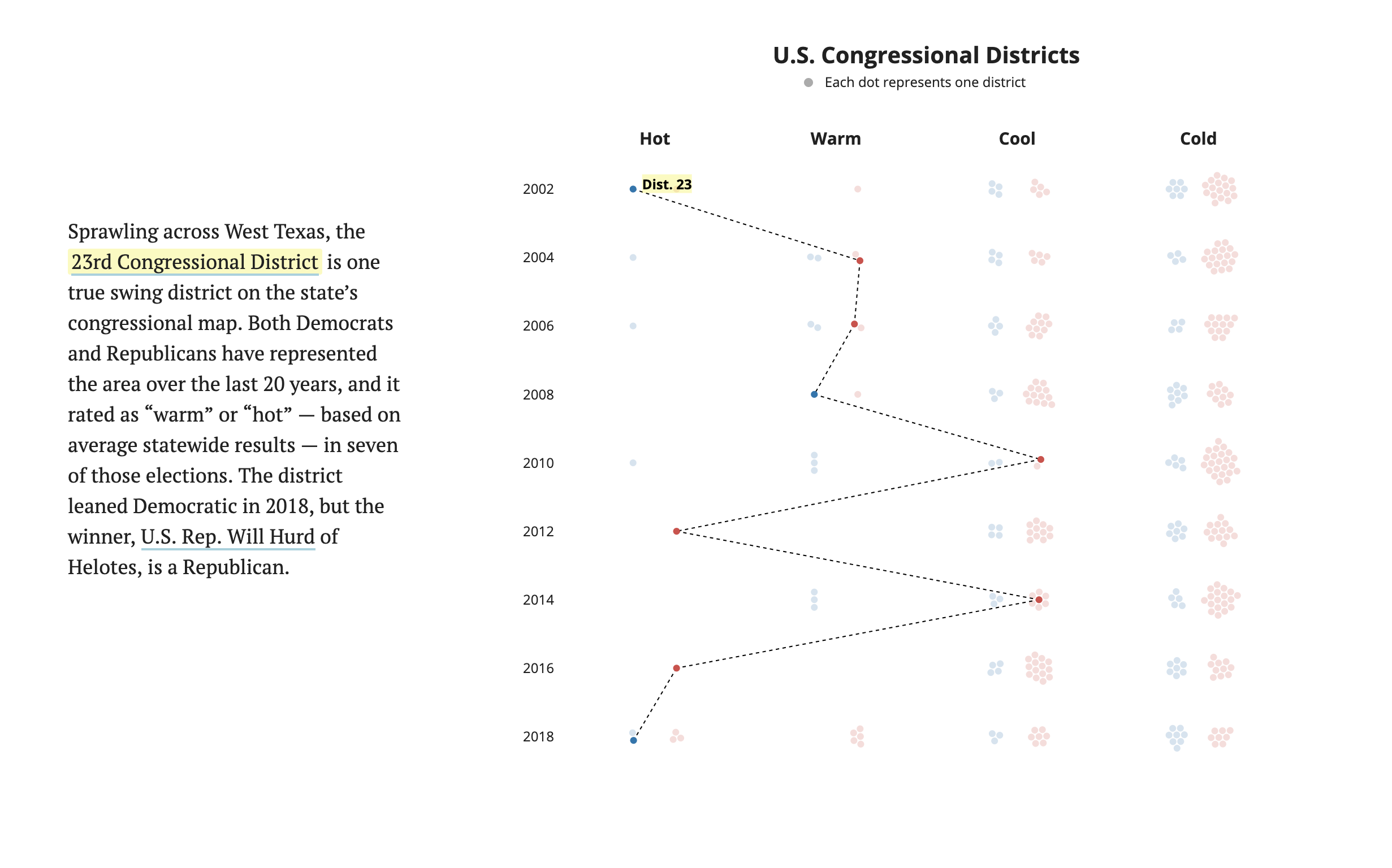
I worked mainly as a designer and developer for this project. The visualization was built using Javascript with its d3 and react libraries. The development process involved lots of iteration and experiments with visualization techniques. The geography of the districts doesn’t matter nearly as much as how they have voted, so I decided to display that change over time as clusters of circles.
-
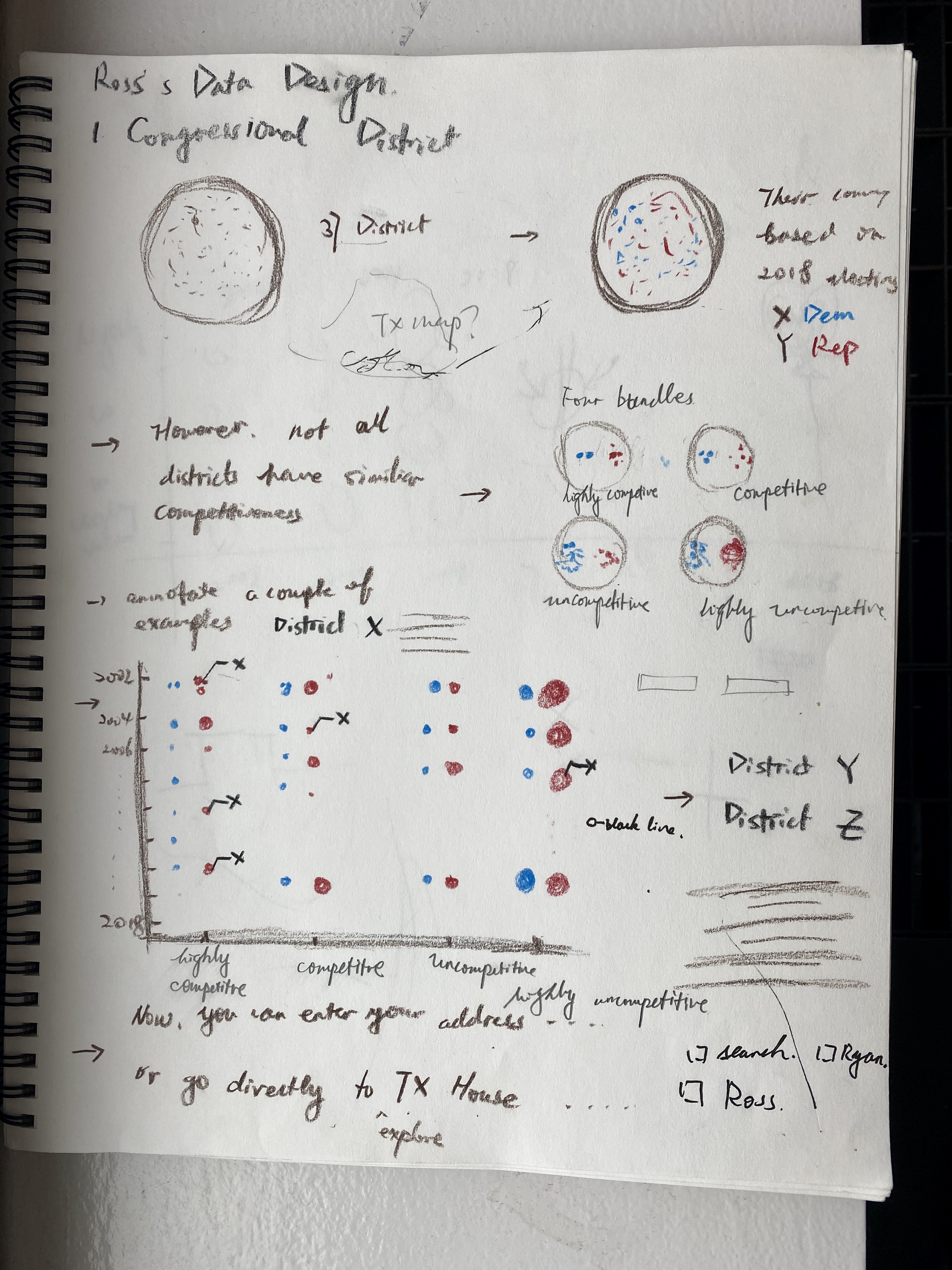
Early sketch
This project received tremendous feedback from readers, both political insiders and otherwise, who said they appreciated what the analysis told them about which way Texas could vote next:
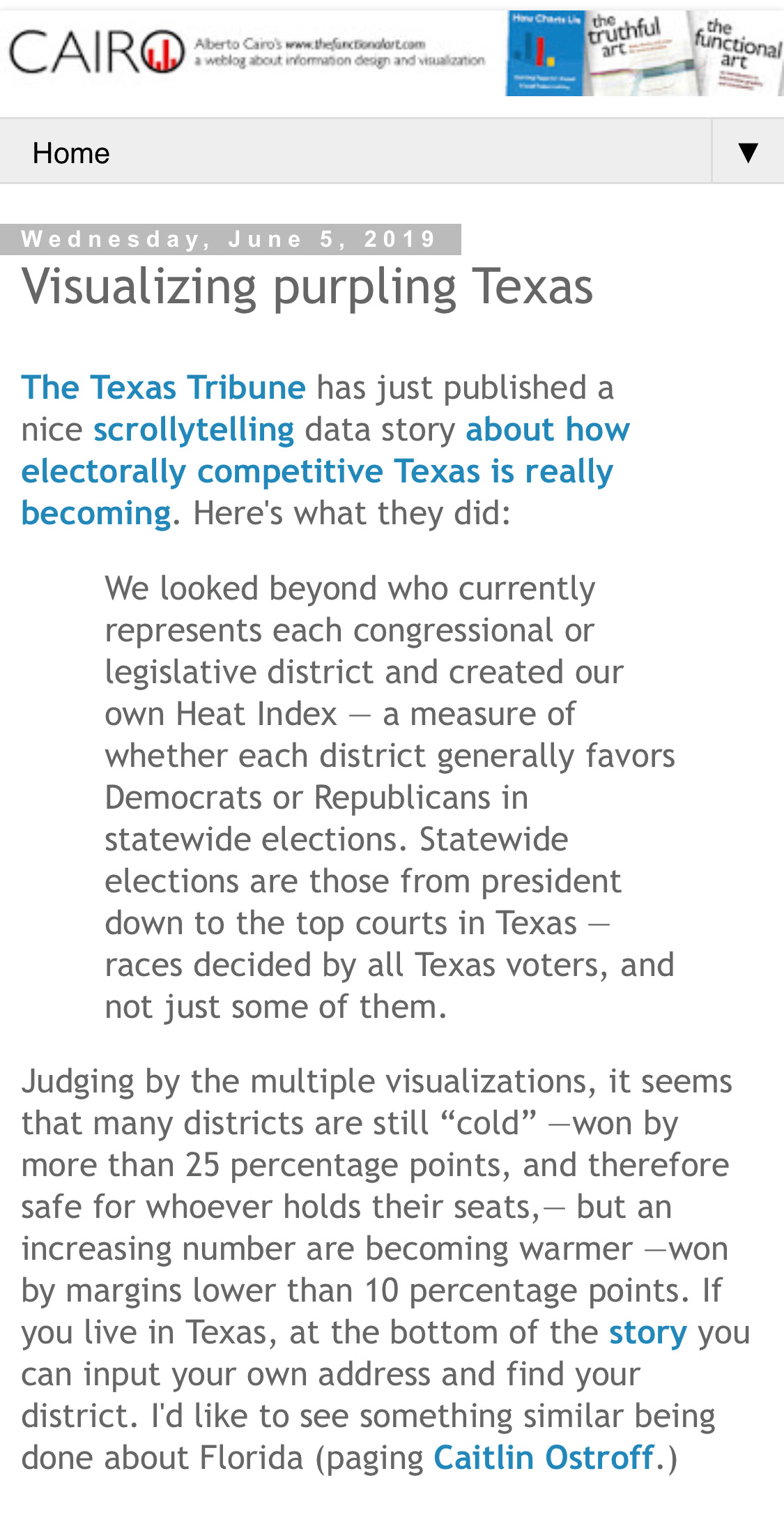
Alberto Cairos, the Knight Chair in Visual Journalism at the University of Miami, writes about the story and even called for "something similar being done about Florida" in his blog post. Local politicians also cited our project for fundraising.

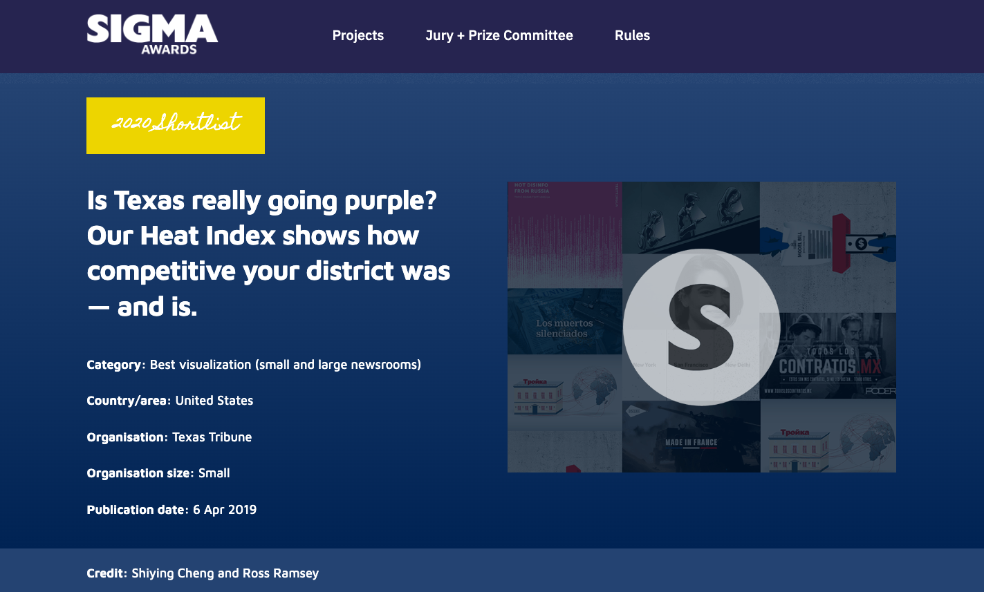
In addition, this project was named finalist for The 2020 Sigma Awards, the largest global competition honoring data journalism work.
Desktop Version: